3.2 Displaying the Data
| Goals: |
|
Data is not very visually appealing if left as an array. Instead, summarizing the data as a graph or within a table provides alternative ways of viewing data. In this section, we’ll study techniques that will allow us to visualize data.
3.2.1 Frequency Distributions, Histograms, and Bar Graphs
One useful visual data summarization that is the frequency distribution.
Definition (Frequency Distribution).
A table summarization of data that involves mutual exclusive intervals of equal width known as bins or classes which the frequencies that data values lie within each of the bins is tallied.
The process for constructing a frequency distribution is fairly straight-forward but involves several steps and calculations. The following four steps are the guidelines for constructing one, given a sample of data.
-
1.
Choose the number of bins, , to use. Typically, will be a value between 5 and 20. Too many or too few bins will cause the frequency distribution to lose shape characteristics of the data.
-
2.
Determine the width of the bins. One approach is to compute the following:
The max and min are the maximum and minimum value in a sample of data, respectively.55The commands and compute the maximum and minimum values in Excel without having to order the data and observe the largest and smallest. The symbol returns the rounded-up value of . It is called the ceiling function.66Excel also has a command for the ceiling function. It is . Note that the ceiling function is not necessary. Often, we use the calculation as a guide and choose a nice, rounded value for the bin width.
-
3.
Construct the bins. Choose a starting value that is less than or equal to the minimum of the sample, . By adding the bin width, , from above, we have the first bin as . The next bin would then be . (Notice that the left-endpoint is not included in the second bin and all of the bins thereafter. The right-endpoint is included in each of the bins.) Each of the bins should be disjoint, or not have anything in common. Continuing this process, we arrive a bins of width that appear as:
The bins should blanket all of the data in the sample. That is, the last bin should include the maximum value of the sample.
-
4.
Count of the frequency of data from the sample that belongs in each bin. Essentially, just add up how many of the data values belong to each of the bins.
Example 3.2.1.
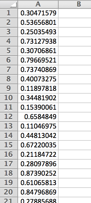
Let’s construct a histogram for 100 randomly generated data values between .
Begin by generating a sample of 100 from the interval . This is done with the command . Figure 3.21 gives a snapshot of some of the data values.
-
1.
Let be the number of bins we’d like to have.
-
2.
Calculating the bin width, we have
-
3.
Since the lowest attainable values is zero, we begin with this as the left-endpoint of the first bin and proceed with adding to form the rest of the bins.
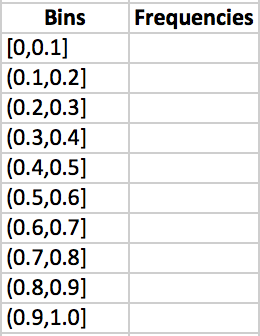
Figure 3.22: Excel will calculate the frequencies for each of the bins for us. However, we need to tell Excel what the bins are. Excel only needs the right-endpoints of each of the bins. In another column, enter in the just the right-endpoints of the bins.
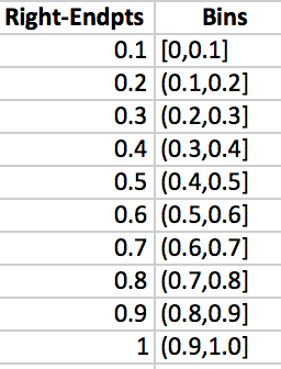
Figure 3.23: -
4.
Highlight the cells adjacent to each of the bins in the frequency column and type the command .
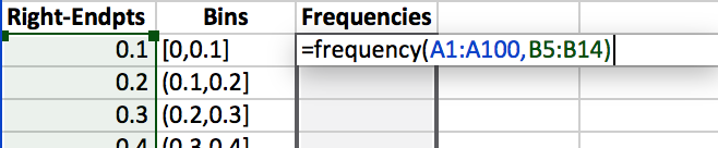
Figure 3.24: Press CONTROL+SHIFT+ENTER and the column will auto-fill with the appropriate frequencies.
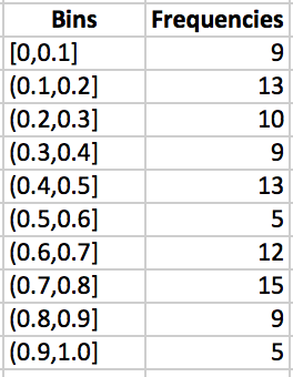
Figure 3.25: The result is a frequency distribution.
Histograms
A frequency distribution is often displayed as a table. A better and more visual representation of the data in a frequency distribution is what is known as a histogram.
Definition (Histogram).
A graph for quantitative data that displays an associative frequency distribution as bars. The height of each of the bars determines the frequency of data that falls within each of the bins. Typically, no gap is left between each of the bars in a histogram.
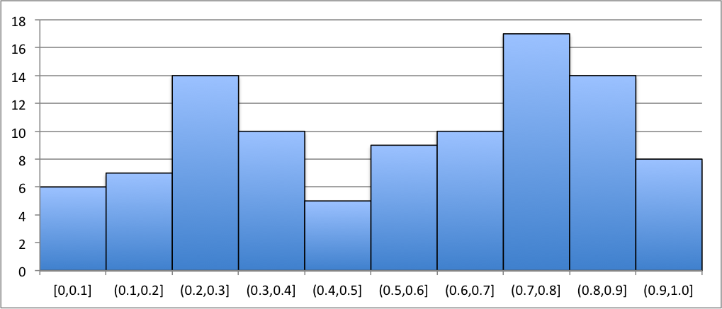
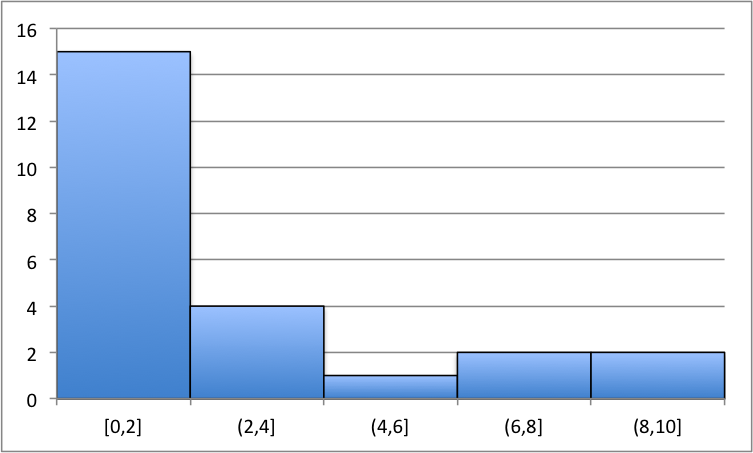
Here are a couple graphs that display histograms for their associated frequency distributions. From the graphs, one should observe the shape and size. We can immediately recognize where most of the data values fall and where the least of the data values fall.
|
|
In Figure 3.26, we see that the histogram doesn’t seem to exhibit any recognizable shape. The bin has the highest frequency of data values from the sample and has the least.
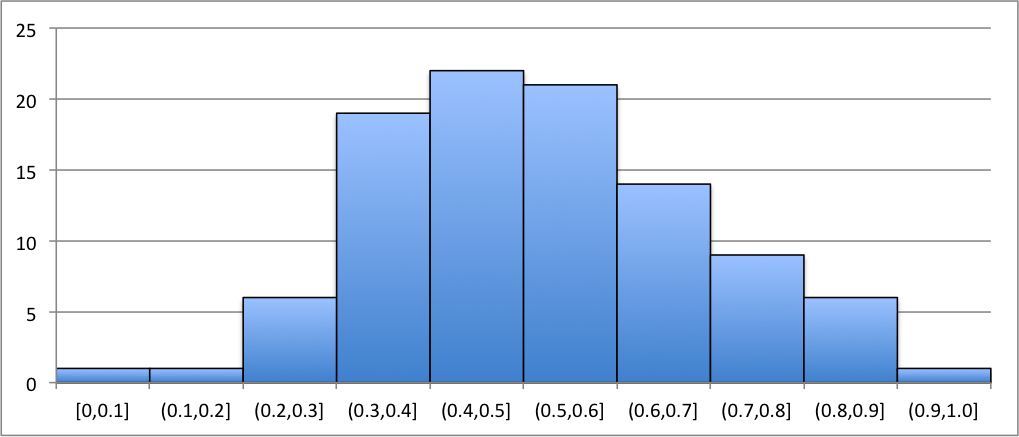
In Figure 3.26, the histogram seems to exhibit a bell-shaped image. The highest frequency of data looks to be towards the center of the graph and happens to be in . The bins with the least happen to occur on the right and left tails of the histogram. There happens to be, in the particular case, three bins with the least frequency.
Example 3.2.2.
Let’s generate a random sample of 100 data and construct a histogram of the sample using the Excel command 77The command will be discussed later. In this example, we can use it to generate random data. Note that we could have also used the Data Analysis Random Number Generation Tool.
Using the command , we generated 100 data values for our sample.
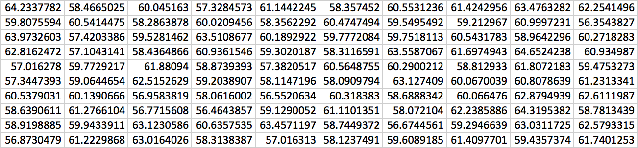
The maximum of the data is 64.65242379 and the minimum is 56.35438272. Using 10 bins, we obtain the following as our frequency distribution.
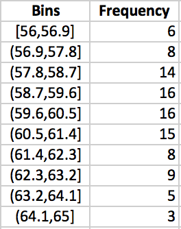
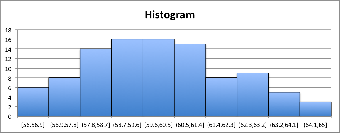
Notice that each of the bins are of width 0.9. Highlighting the frequency column and selecting the bar graph chart from the ribbon, we then obtain the histogram pictured in Figure 3.29. Notice that we edited the chart to display a title and to display the bins below each of the bins. Also notice that there is no gap between each of the bars and border was included to denote the borders of each of the bins.
Bar Graphs
Similar to a histogram, we have what is called a bar graph for qualitative data.
Definition (Bar Graph).
A graph for qualitative data that displays an associative frequency distribution as bars. The height of each of the bars determines the frequency of data that falls within each of the bins. Typically, a gap is left between each of the bars in a bar graph.
When constructing the frequency distribution for qualitative data, the bins are all the possible outputs of the qualitative variable.
Example 3.2.3.
A school states that their student body is made up of 52% women and 48% men. Let’s create a bar graph that shows a representation of the average class of 30 students, given this student body make-up.
Let the value 0 represent MALE and the value 1 represent FEMALE. Using the Data AnalysisRandom Number Generation Tool, we initiate the generator a such in Figure 3.30.
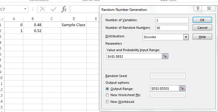
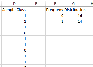
Pressing OK, we have a sample of class at the school. Let’s create a frequency distribution of this sample. For discrete variables, the bins need only be the possible outputs of the variable. In cell and , enter 0 and 1, respectively. The following is a portion of the authors’ sample and the associated frequency distribution.
Highlighting the frequency column and selecting the bar graph chart from the ribbon, we then obtain a bar graph similar to that in Figure 3.32. However, note that we edited the chart to display Male and Female instead of 0 and 1.
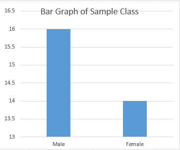
Remark: As a reminder, note the difference between a histogram and a bar graph. A histogram has the bars abut one another and is primarily for quantitative data. A bar graph has space between each of the bars and is primarily for qualitative data.
3.2.2 Pivot Tables
Pivot Tables are an incredibly useful tool in Excel. They allow the user to quickly summarize large amounts of data with minimal effort. However, pivot tables have a tendency to be intimidating. In this section, we will introduce pivot tables and show how they can be used to construct frequency distributions, bar graphs, and histograms.
In order to construct your data set, you first want to make sure that the cells in the top row of your data consists of the variables names of each column. Pivot Tables will treat of the cells in the top row of your data as the field names. More explanation of a field name will be given later.
After getting your data organized, initializing the pivot table is pretty simple. Locate the pivot table button on the ribbon88The location of the pivot table button differs from Excel version to version. For Excel 2016, it is located under the Insert Tab. It looks like this: ![]() . Highlight your data that you want to manipulate with a pivot table and click the pivot table button. A menu will pop-up similar to that in Figure 3.33.
. Highlight your data that you want to manipulate with a pivot table and click the pivot table button. A menu will pop-up similar to that in Figure 3.33.
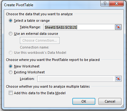
The menu in Figure 3.33 allows the user to place the pivot table where he or she chooses. The authors recommend leaving the default setting of new worksheet as it is so that the pivot table does not clutter the workspace. Clicking ok on the Pivot Table Setting Menu then causes Excel to create a new worksheet with the propogated fields and areas.
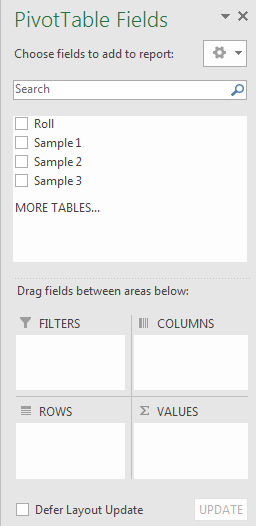
From here, the user is free to manipulate the table into what he or she desires. This is done by clicking and dragging the fields into either of the areas: Filter, Rows, Columns, or Values. Recall that the fields are really the labels of each of the columns in the data. Figure 3.34 is an example of a pivot table that could be constructed with the fields Roll, Sample 1, Sample 2, and Sample 3.
Remark: Caution. it is important to make sure that the columns in the data that is to be used in the pivot table be labeled. If not, the first row of the data will always be used as the field names in the pivot table.
Let’s see how we can use pivot tables to easily construct frequency distributions, bar graphs, and histograms.
Example 3.2.4.
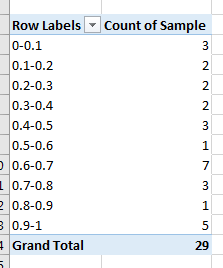
Let’s use a pivot table to quickly generate a frequency distribution for 30 data values generated by the .
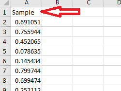
Assuming we already have a sample of 30 data values from with the first cell stating Sample (see Figure 3.35, highlight the data and click on ![]() . Then click ok to place a pivot table on a new worksheet.
. Then click ok to place a pivot table on a new worksheet.
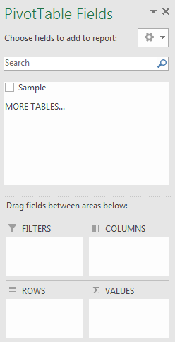
On the right-hand side of the workspace, you’ll notice menu called Pivot Table Fields, see Figure 3.36.
Click and drag the field named (also the same as the column name of our data) Sample down into the ROWS area. You’ll notice the pivot table starting to take shape. Each of the data values are displayed as the rows of our table.
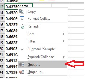
A frequency distribution requires bins to be our rows. Excel calls them groups within a pivot table. Right-click on the table being constructed and click on Group…, (see Figure 3.37).
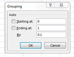
Based on our data, let’s create 10 bins starting from 0 to 1. The menu that pops up allows us to group based on this rule. Input the appropriate values similar to that in Figure 3.38.
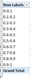
Clicking ok will adjust the rows in the pivot table accordingly.99The bins displayed are intervals. They follow the same interval rules as in Section LABEL:freq. See Figure 3.39.
Note: if the menu as seen in Figure 3.36 disappears while manipulating the table, clicking on the table will always bring it back.
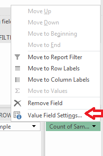
In order to get the frequencies of each of the groups, click and drag the field name Sample down to VALUES. Yes, you can drag the same field to more than one area! Left-click on the drop-down that is created from dragging Sample to VALUES. Locate the option Value Field Settings and click it, see Figure 3.40.
You should get a pop-up displaying the different calculations for the values pertaining to fields. Make sure that Count is selected and click Ok.
Take a look at your table. You should notice that the table is now displaying a frequency distribution of your data.
Remark: There are several other options available in the Value Field Settings. In particular, there are two different Count options. The first count counts strings and numbers. The second Count Numbers option counts only numbers and not strings. Be sure to select the appropriate one that suits you.
Example 3.2.5.
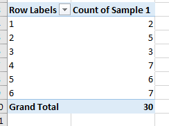
Let’s use a pivot table to construct a bar graph of a sample of outcomes from rolling a fair, six-sided die 30 times.
First, generate a sample of 30 rolls of the die by using the command . Let’s label the data as Outcomes.
Highlight your data and click on ![]() . Have the pivot table initialize on new worksheet.
. Have the pivot table initialize on new worksheet.
Once you have done this, click and drag the field outcomes to both ROWS and VALUES.
Change the Value Field Settings to display the count of the field outcomes.
As a result, your table should look like Figure 3.42. Note the authors’ data will be different than yours.
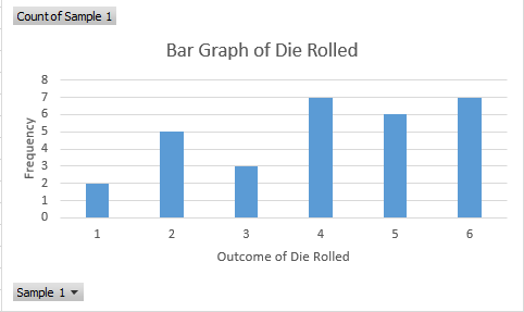
Recall how to make bar graphs. With pivot tables, creating charts is easy to do. Click on the table and then insert a bar graph. Excel will automatically generate the graph.
Note that histograms can be constructed in the same fashion as in the previous example.
 3.
Use a pivot table to construct a frequency distribution of the following outcomes from a qualitative variable.
Orange
Orange
Red
Red
Green
Green
Blue
Green
Orange
Orange
Orange
Blue
Green
Green
Red
Red
Orange
Blue
Blue
Red
Answer:
3.
Use a pivot table to construct a frequency distribution of the following outcomes from a qualitative variable.
Orange
Orange
Red
Red
Green
Green
Blue
Green
Orange
Orange
Orange
Blue
Green
Green
Red
Red
Orange
Blue
Blue
Red
Answer: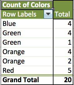
3.2.3 Exercises
-
1.
Answer the following as True or False.
-
(a)
A histogram is for qualitative data.
-
(b)
We typically leave a gap between bars in bar graphs.
-
(c)
Pivot tables can generate histograms.
-
(d)
The value 5.2 belongs within the bin .
-
(e)
Pivot Tables cannot be used to construct frequency distributions.
-
(a)
-
2.
Use the function to generate a random sample of size from the following intervals. Then construct a frequency distribution of the sample.
-
(a)
,
-
(b)
,
-
(a)
-
3.
Create histograms for each of the frequency distributions constructed in Problem (3) above.
-
4.
Generate a sample of 200 data values using the command and construct a histogram. Comment on the shape.
-
5.
Use the command
to generate a sample of 400 different favorite colors taken over the years. Use a pivot table to construct a bar graph of the data. Which color is more likely to occur as a favorite?
-
6.
The maximum number of bins one should use can be calculated using formula: , where is the sample size and is the number of bins. Given a sample size of , determine the maximum number of bins needed to construct a frequency distribution.
-
7.
Generate a 3 random samples of a fair, six-sided die rolled 30 times. Using pivot tables, construct a frequency distribution of each of the random samples.
-
8.
Repeat the previous exercise by using filters in the pivot table. Hint: This will involve arranging your data in a particular way…