10.9 Optional: Normal Q-Q Plots
A sensible way to check whether it is reasonable to assume a sample comes from a normally distributed population is to look at a histogram of the sample. But, the shape of a histogram depends heavily on the choices for the bins. As such, it is good to have other methods for checking the assumption of normality, especially in the case where a -Test is being considered and the sample size is not large. One such method is called a Q-Q plot.
A Normal Q-Q plot compares the percentiles of the sample data to corresponding percentile scores of the standard normal distribution This is done as follows:
-
1.
Sort the sample data, from smallest to largest.
-
2.
Compute the rank order of each data point, from smallest to largest.
-
3.
Compute the percentile rank of each of the ranks.
-
4.
Compute the corresponding value percentiles in the standard normal distribution
-
5.
Plot (a) versus (c) in a scatter plot.
If the sample comes from a population that is nearly normal, the plot of points should look somewhat linear. If the plot doesn’t look somewhat linear, using a -Test may not be appropriate if the sample size is not large.
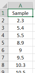
Here’s how to do it in Excel. Let’s assess whether the following data can be assumed to have come from a normal distribution:
Put the sample data into a single column, and sort from smallest to largest, as shown in Figure 10.41.
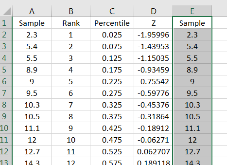
Rank the data from smallest to largest, as shown in Figure 10.42.
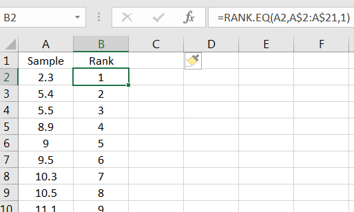
You don’t have to use the command to do the rankings, but it is a useful command in some nonparamteric tests. (The gives an average rank in the case that there are ties.)
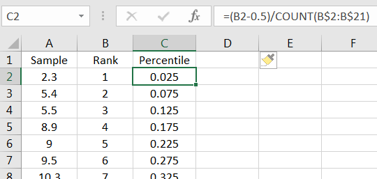
Next, compute the percentile for each rank. This can be done using the formula:
as shown in Figure 10.43.
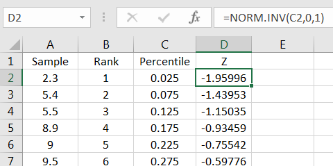
In the adjacent column, compute the corresponding percentile in the standard normal distribution as in Figure 10.44.
For ease, copy the first column into the empty adjacent column on the right, as in Figure 10.45.
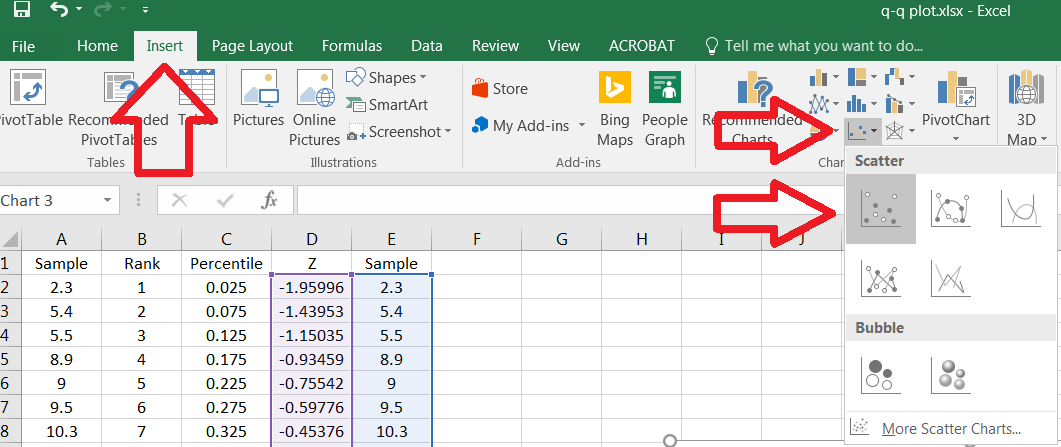
Select to data in two rightmost columns, then click on the Insert tab. Click on the Insert Scatter (X,Y) button, and then select the Scatter option, as in Figure 10.46.
You will get the scatter plot shown in Figure 10.47.
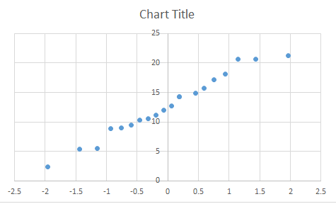
This is a Normal Q-Q plot for the sample. If the sample comes from a normally distributed population, then points would be expected to look relatively linear, as is the case with this example. It would be reasonable to conduct a -Test using this sample.