6.3 Distribution of the Sample Proportion
As we saw earlier, the sample proportion is the best point estimate (single number estimate) for the proportion of a population. We also noted that it is almost certainly not the actual population proportion. In fact, we noted that as we take different samples, even of the same size, we will get different values for the sample proportion. Thus, the sample proportion, , is a variable. If we wish to use the sample proportion in trying to make inferences about the actual value of the population mean, we must better understand the behavior of the sample proportion. The behavior of the sample proportion is called the sampling distribution of . As was the case above, we will use a known population, one that we actually know the parameter, so we can better understand the connection between the statistic and the parameter.
Example 6.3.1.
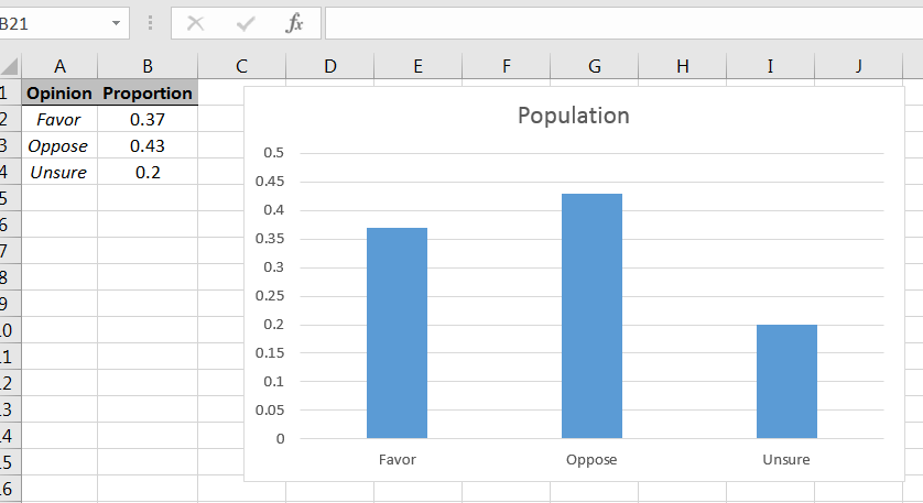
Consider a population of voters in which we want to estimate the proportion of those who favor Proposition A. To simulate how sample proportions behave, let’s assume the the population is as follows:
| Opinion on Prop A | Proportion |
|---|---|
| Favor | 0.37 |
| Opposed | 0.43 |
| Unsure | 0.20 |
Using the bar chart command in Excel, the population can be shown graphically as in Figure 6.27.2626Recall that with histograms that the classes abut, but with bar charts there ar gaps between the bars.
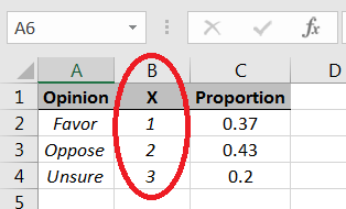
We can use the Discrete random number generator option in the Data Analysis Excel library, but the command works with numbers, not strings, i.e., we need to choose numbers to represent the different types of opinions:
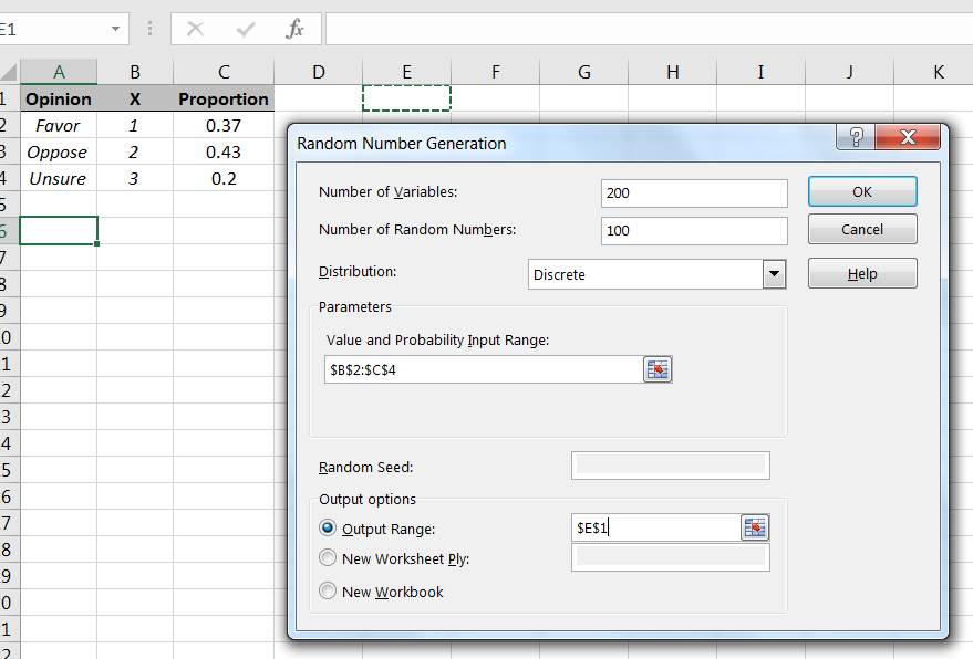
As with the sample means, to get a sense of how sample proportions behave, we will simulate taking a large number of random samples from the population, and then for each sample, compute its corresponding sample proportion In this case, since we are interested in those who favor Proposition A, we will count 1’s in the samples. Let’s simulate taking 200 samples of size 100 from the population, as in Figure 6.29.
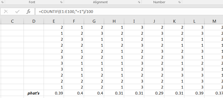
Recall that in the results each column represents a sample of size 100 from the population. We can use the Excel command COUNTIF to count the number of 1’s in each sample. Dividing each count by 100 will give the corresponding sample proportion, as shown in Figure 6.30.
A histogram will give a visual description of behavior of the sample proportions. Using Excel’s Histogram command will yield a graph similar to Figure 6.31.
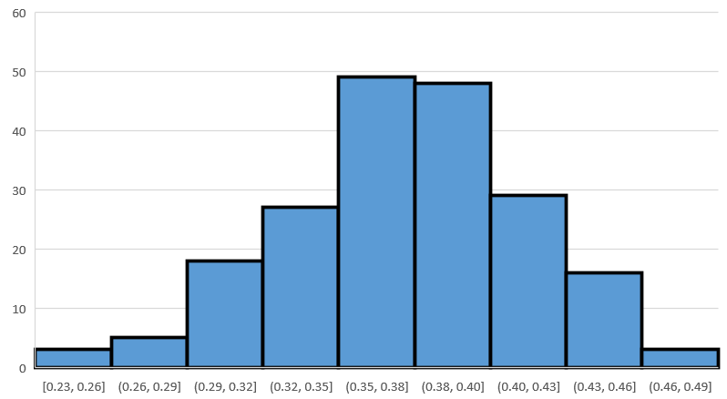
Your histogram will likely look a bit different, but the moral will be same. The shape of the distribution of sample proportions is roughly bell-shaped and symmetric, with the axis of symmetry located roughly at the population proportion, namely 0.37 in this case.
Example 6.3.2.
Using the same population as in the previous example, suppose that we increase the sample size to 200. What will that do to the distribution of ’s? We can get a sense of what happens by doing another simulation. Repeat the steps outlined in the prior example, but change the sample size from 100 to 200. (When you compute the ’s, remember to divide by 200, instead of 100.) Your histogram of the sample proportions will look close to Figure 6.32.
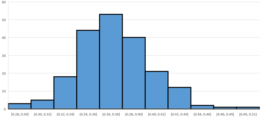
The histogram will be roughly bell-shaped and symmetric, as before, and with the axis of symmetry near 0.37, the population proportion. But, compare the horizontal scale to the one in Figure 6.31, and you will observe that the spread of the ’s has decreased. You can verify the axis of symmetry and spread by computing the sample means and sample standard deviations of the two simulated samples of ’s. You’ll find following:
-
•
Both sample means of the ’s will be about 0.37.
-
•
The sample standard deviation of the ’s with sample sizes of 100 will be close to 0.48, while the sample standard deviation of the ’s with sample sizes of 200 will be close to 0.34.
Remark: The “bell-shaped and symmetric” upshot of these two examples depend on the samples from the population being sufficiently large, i.e., the samples cannot be “too small.” If the sample size isn’t sufficiently large, then the distribution of sample proportions may not be approximately bell-shaped or symmetric. In trying to say something with confidence about an unknown population proportion, the sample size being sufficiently large will be critical.
6.3.1 Section Summary
The distribution of sample proportions will be roughly bell-shaped and with peak located approximately at the population proportion provided the sample size is sufficiently large.
6.3.2 Exercises
-
1.
A large population consists of two type of things, things of Type A and things of Type B. The proportion of things of Type A is 0.24. Simulate taking 150 samples of size 250 from this population. For each sample, compute the sample proportion of things of Type B. Create a histogram of the simulated sample proportions, and describe the distribution.
-
2.
If Excel’s RANDBETWEEN works well, then the probability =RANDBETWEEN(1,10) generates a 1 should be 0.1. To test if the command “works well,” simulate taking 200 samples of size 100 from the population RANDBETWEEN(1,10). For each sample, compute the proportion of 1’s. Create a histogram of the sample proportions, and describe the distribution.
-
3.
Consider the experiment of rolling three fair six-sided dice and considering the product of the values on the first two rolls added to the value on the third roll. Suppose the variable of interest is the proportion of these values that are less than 11 (less than or equal to 10). By considering 30 samples of size and looking at a histogram of the sample proportions, visually estimate the proportion of values that are less than 11.
-
4.
Using the command =-10*LOG(1-RAND(),EXP(1)) in Excel will produce a random number. Consider the random numbers produced by this command as the population. Use the sampling distribution of the sample proportion to estimate the proportion of the population of random numbers produced by that are less than or equal to 10. Use 30 samples of size and visually estimate the proportion from the histogram of your data set.