6.2 Distribution of the sample mean
As we saw earlier, the sample mean is the best point estimate (single number estimate) for the mean of a population.2121In this section, a population will always be a population of numbers that has a population mean. Some populations of numbers do not have means, but pathological examples like those are not important in this course. We also observed that the sample mean is often not equal to the actual population mean, i.e., as different samples are taken, even of the same size, the observed values of the sample means will vary. Thus, the sample mean, , is a variable. Since we wish to use the sample mean in trying to make inferences about the actual value of the population mean, we must understand the behavior of the sample mean. The behavior of the sample mean is called the sampling distribution of . To study the behavior of we will start by looking at samples from populations where we know the distribution of the population and the mean While we typically will not know the population distribution or this will allow us to make connections between sampling distributions and population distributions.
Example 6.2.1.
We will first consider a population that consists of numbers, with each number an integer equal to one of 1, 2, 3, …, 10.
We will make two assumptions of the population. First, we will assume that the population is large, i.e., removing a member of the population does not change the distribution of the population. In this particular case, “large” means that the population contains infinitely many 1’s, infinitely many 2’s, etc.2222The same effect is achieved by sampling with replacement.
Secondly, we will assume that the proportions of the numbers in the population are the same, meaning that the population distribution is uniform. The population distribution can be graphed as follows:
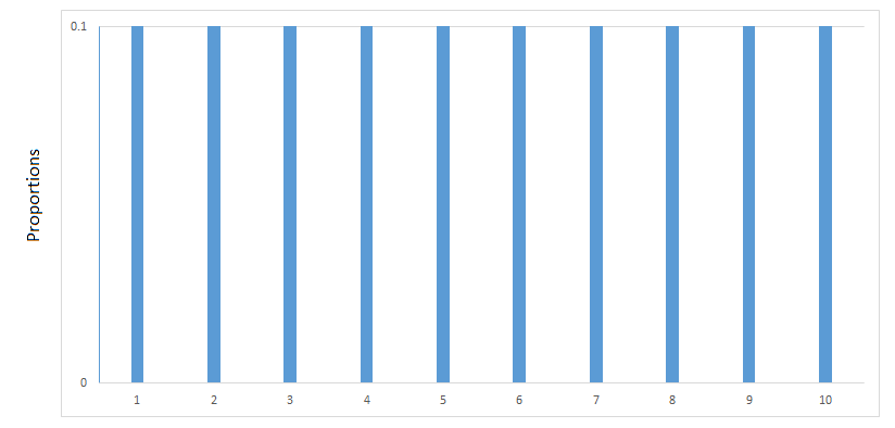
This population has a mean and if you suspect that the mean is equal to 5.5, then you are correct. The question at hand is how will sample means behave given that the population distribution is as above. Using Excel, we can build intuition of the behavior of via simulations.
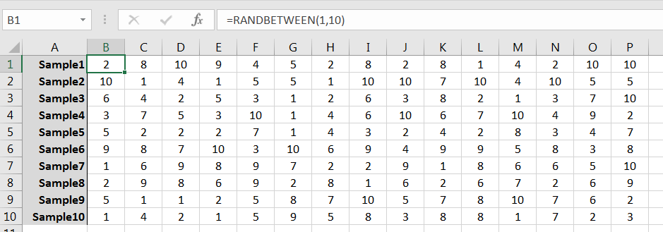
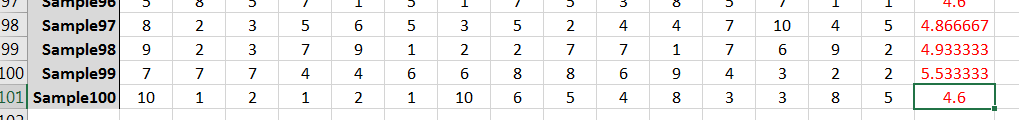
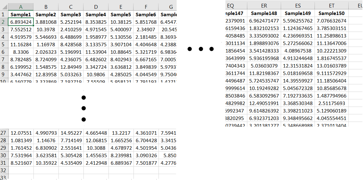
The command RANDBETWEEN(1,10) can be used to simulate randomly selecting a single member of the population. Repeated use of the command can be used to generate a sample, and from there many samples. For example, 10 random samples of size 15 might look like those given in Figure 6.3. (Note that the samples as given row-wise; column-wise would work fine too.)
Use AVERAGE() to compute the sample mean for each sample:
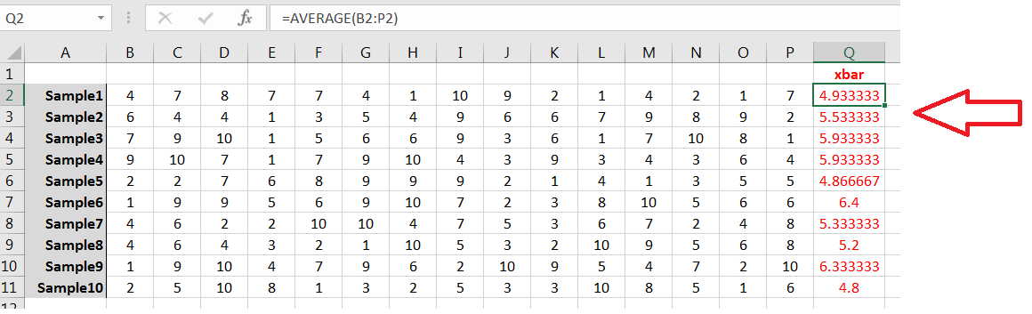
Your samples and sample means likely will be different from the above, but note the behavior:
-
1.
Few, if any, of the ’s are equal to
-
2.
All ’s are between 1 and 10;
-
3.
Most of the ’s are between 4.0 and 7.0, i.e., the ’s are more likely to be “close” to 2323It is possible for most of the ’s (6 or more of the 10) to be either less than 4 or greater than 7, but that will happen to fewer than 0.0001% of readers. Note that in Figure 6.4 100% are between 4.0 and 7.0. It’s likely the case for you as well.
Ten sample means is not sufficient for a good histogram, but 100 ’s would do nicely:
Using Excel’s Insert Statistics Chart command on the Insert tab will yield a result similar to the following:
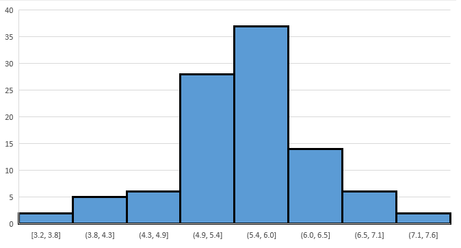
Your histogram will look a bit different, and you may need to tinker with the graph’s bins, but the behavior will be similar:
-
1.
Most ’s are concentrated in the interval
-
2.
The farther away a possible value for is from the less likely that value is observed;
-
3.
The shape is roughly bell shaped and symmetric around the mean
The shape of histogram for the ’s is not only influenced by the population distribution, but by the sample size as well. To simulate the latter, generate 100 samples of size 50 from the same population. For each sample, compute the corresponding , and then build a frequency histogram for the 100 ’s. You get something like this:
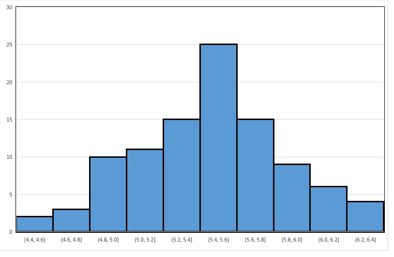
First note the similarity in shape to the graph in Figure 6.6: both are symmetric and roughly bell-shaped about the mean The striking difference is the spread of the ’s. In Figure 6.6, the sample means vary (roughly speaking) between 3.2 and 7.6, and are most concentrated in the interval in Figure 6.7, the sample means vary from 4.4 to 6.4, and are most concentrated in . That is, by increasing the sample size from 15 to 50, the standard deviation of the sample means decreased.
Example 6.2.2.
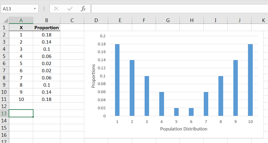
We now consider a different population. This population too will be large and consist of integers from 1, 2, 3, …, 10. But, the proportions will be as follows:
| X | Proportion |
|---|---|
| 1 | 0.04 |
| 2 | 0.12 |
| 3 | 0.24 |
| 4 | 0.18 |
| 5 | 0.12 |
| 6 | 0.10 |
| 7 | 0.08 |
| 8 | 0.06 |
| 9 | 0.04 |
| 10 | 0.02 |
The population can be graphically displayed as follows:
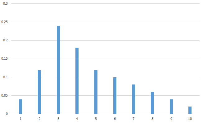
As you can see, the population is skewed right. And while the mode is at 3, the population mean has been shifted to the right and looks like it might be between 4 and 5.
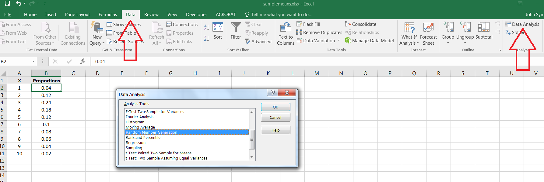
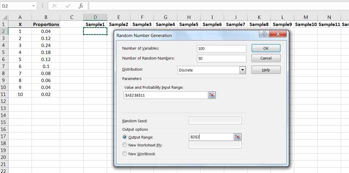
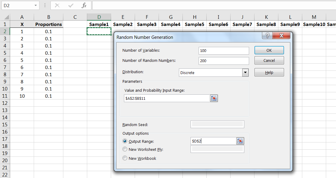
We can simulate samples from this population using Excel’s Random Number Generation command in the Data Analysis library.2424It’s also possible to simulate samples from this population using the Excel commands RAND() and IF() First, we need to input the values and proportions into Excel as follows:
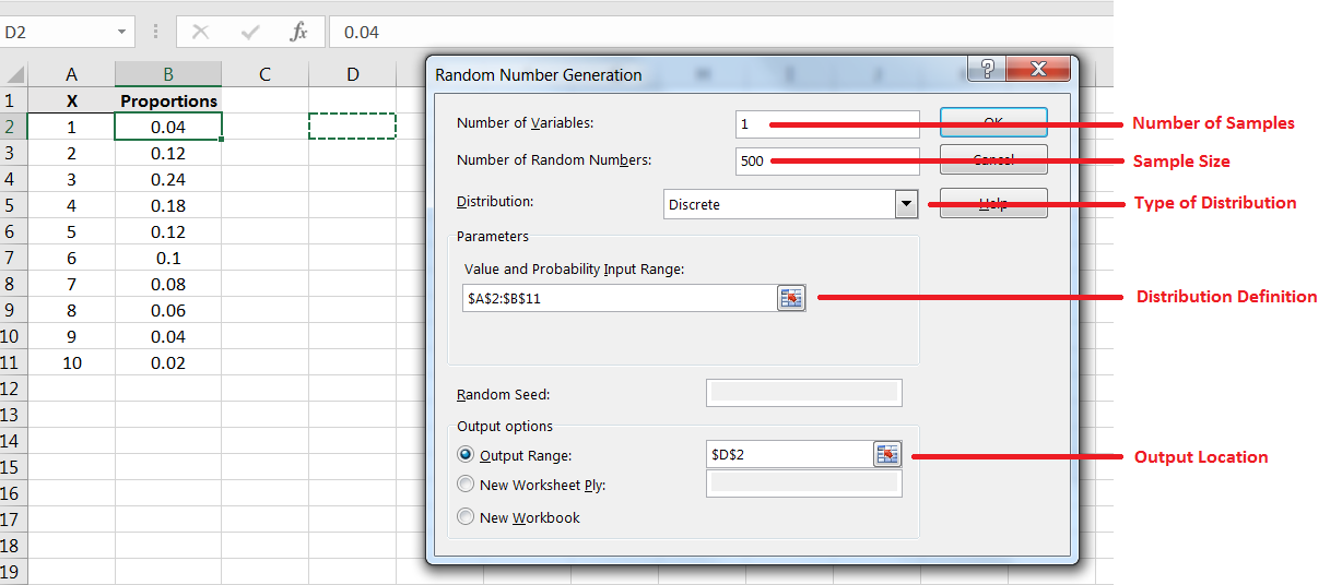
Let’s first estimate the population mean using a sample of size 500.2525Full disclosure: it is possible to compute the mean directly for this population. For each possible value in the population, let denote the corresponding proportion. Then the mean is equal to the weighted sum In this case then, the population mean is exactly 4.52. Locate the Random Number Generation command:
To generate a single sample of size 500, input as shown in Figure 6.11. Note the function of each field.
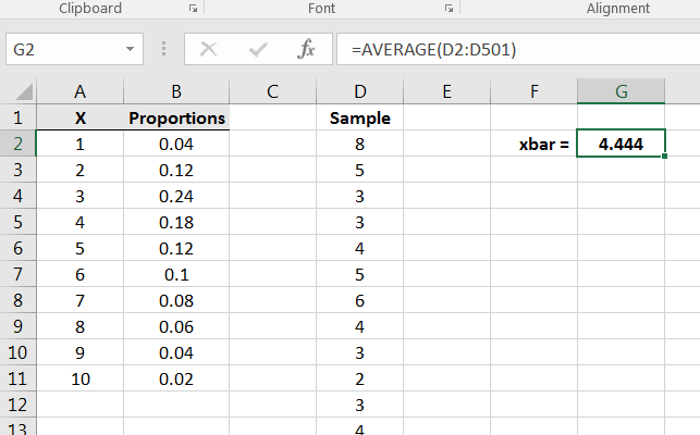
After generating the sample, compute the sample mean, thus giving a point estimate for the population mean as in Figure 6.12.
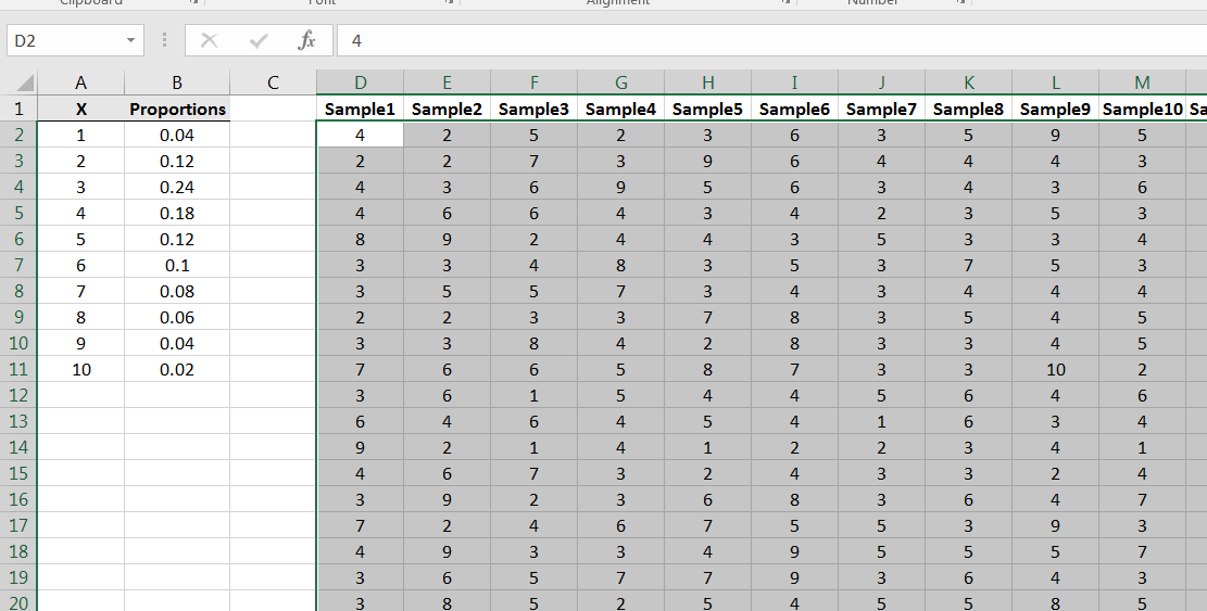
Recall that the key issue if how the sample means behave. How confident can we be that computed in Figure 6.12 is close to the population mean Repeating the structure of the prior example, let’s simulate 100 samples of size from this population. Repeat the Random Number Generation command:
Each column of 50 numbers is a sample of size 100 from the population:
At the bottom of each column, compute the corresponding sample mean:
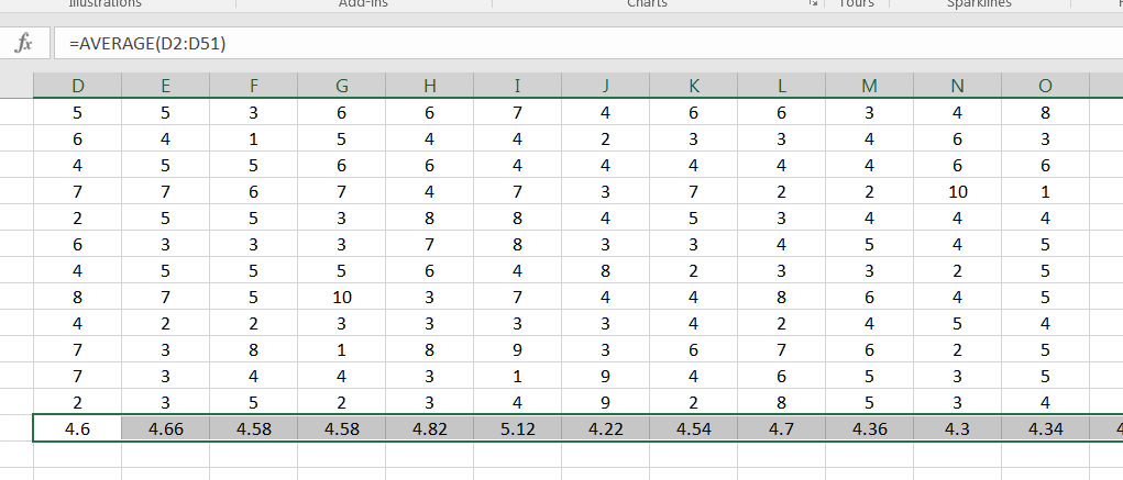
Your histogram for the sample means will look something like the following:
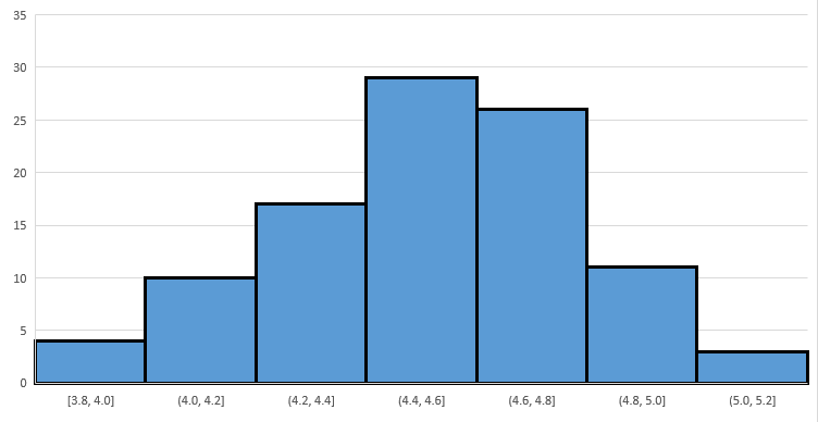
Note that as with Example 6.2.1, Figure 6.16 implies that the sample means have a distribution that is roughly symmetric and bell-shaped, and is centered on the population mean
Example 6.2.3.
Consider the population as described in Figure 6.17:
Note that the population is symmetric but heavily weighted to the extremes. Due to the symmetry, we can see that the population mean is exactly 5.5. How will sample means behave for samples from this population?
Repeating part of Example 6.2.2, simulate taking 100 random samples of size from the population:
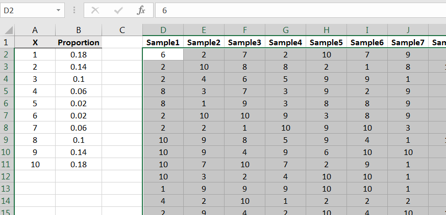
Compute the sample means, and then create a frequency histogram for the 100 ’s. You’ll get something similar to Figure 6.19:
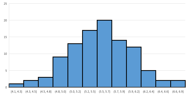
Again we see that the distribution of the sample means is roughly ‘bell shaped’ and its peak is roughly located at the mean of the population.
What we have seen in these three examples is that for samples of size , while the populations had very different distributions, the distributions of sample means where each roughly ‘bell shaped’ with peaks at roughly the mean of the population. Is this always the case? That is, regardless of the population distribution, will the sample means with have roughly ‘bell shaped’ distributions with peaks at roughly the population mean? The answer is “no.” However, the sample means will have approximately such a distribution if the sample size is sufficiently large. For example, try the following population:
| X | Proportions |
|---|---|
| 0 | 0.01 |
| 1000 | 0.99 |
Try sample of size and you’ll see a very skewed-left result for the distribution of sample means. However, if you try samples of size you’ll observe a histogram that looks more bell-shaped.
Example 6.2.4.
Let’s observe again the effect displayed in Example 6.2.1, where increasing the sample size decreases the variance in the sample means. Let’s use the sample uniformly distributed population as in that example, but use samples of size instead:
Compute the sample means and build a frequency histogram, and it will look something like this:
In looking for similarities, notice that like the case, in the case the shape is roughly bell shaped and the peak is roughly at 5.5. However, note that the scale of the horizontal axis is smaller, i.e., the spread/variance/standard deviation of the sample means is smaller.
Example 6.2.5.
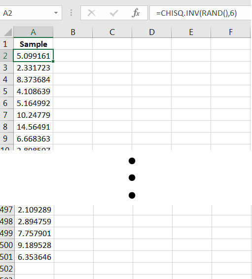
As a final example, we’ll use a population in which the numbers are continuous, i.e., numbers that span an interval. The distribution we will use is called a distribution with 6 degrees of freedom. Generating random numbers from the distribution can be done via the Excel command =CHISQ.INV(RAND(),6). We can visualize the distribution via a histogram of a large sample, say
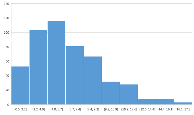
A frequency histogram of the sample reveals that the population distribution is skewed-right, with values always greater than 0, and the population mean is perhaps between 5.0 and 7.0:
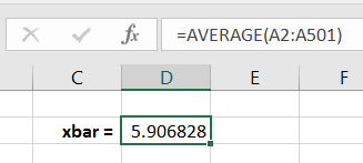
Computing the sample mean yields a point estimate for
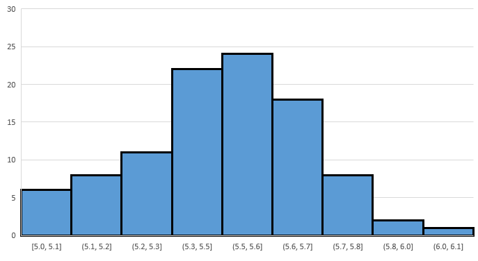
To observe again the behavior of the sample means, let’s generate 150 samples of size 30 from the population:
Compute the sample mean for each column, and then create a frequency histogram of the ’s. You’ll get something similar to the following:
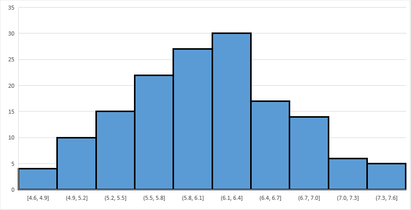
Note the bell-shaped distribution, and that the peak occurs at around 6.1. (The exact value of happens to be 6.)
6.2.1 Section Summary
For a population of numbers with mean the distribution of sample means will be roughly bell-shaped and with peak located approximately at , provided the sample size is sufficiently large. (Note: If the population distribution is symmetric and bell-shaped, then the sample means will have a bell-shaped distribution with peak exactly at , for any )
6.2.2 Exercises
-
1.
Consider the population:
X Proportion -3 0.6 1 0.3 10 0.1 -
(a)
Using a single sample of size 200, estimate the population mean
-
(b)
Using 200 samples, build an approximate picture of the distribution of sample means for samples of size 100. Then use the graph to estimate
-
(a)
-
2.
Consider the population:
X Proportion 0 0.1 3 0.2 8 0.3 15 0.4 Show that there is a sample size where the distribution of sample means is not approximately bell-shaped, and that there is an where the distribution of sample means is approximately bell-shaped. Use the latter to estimate the population mean
-
3.
Consider the random process of rolling three fair six-sided dice. Suppose that the variable (population) of interest is the product of the values on the first two rolls added to the value on the third roll.
-
(a)
Simulate taking a sample of size 1000 from the population as defined, i.e., simulate 400 rollings of three fair die and compute the value of the random variable each time. Use a pivot table to produce an approximate graph of the population distribution.
-
i.
What value appears most likely to occur? What is the approximate probability of observing that value?
-
ii.
Describe the shape of the distribution.
-
i.
-
(b)
Simulate 100 samples, each of size , and determine the respective sample means. By constructing a histogram of this data set of 100 sample means, visually estimate the mean value in rolling three fair six-sided dice and computing the product of the first two added to the third.
-
(c)
Describe the distribution of the sample means when
-
(a)
-
4.
Using the command =-10*LOG(RAND(),EXP(1)) in Excel will produce a random number. Consider the random numbers produced by this command as the population. Use the sampling distribution of the sample mean to estimate the mean of the population of random numbers produced by that command. Use 200 samples of size and visually estimate the population mean from the histogram of your data set.